
Research showed that the biggest frustration with existing Learning Management Systems is the course creation process. For the new 'ONE LMS' platform, we designed a streamlined and intuitive creation module to solve this problem, aiming to empower instructors and provide a key competitive advantage.
The core problem was fragmentation. Course creation was a disconnected series of chores, not a single, creative flow.
Users had to navigate between separate pages for structuring their course, uploading content, and building assessments. This forced them to hold a mental map of their course, leading to errors and a disjointed process.
Most tools used a restrictive "wizard" that locked users into a predefined sequence. This stifled creativity and didn't allow for the non-linear, iterative way people naturally build educational content.
The tools were not designed for power users. Simple tasks like reordering lessons or adding content to multiple items were tedious and involved an excessive number of clicks.
Rashed Kabir
Frustrations
I waste so much time on repetitive tasks. I need bulk actions and efficient ways to update content.
Goals
To easily reuse core content across multiple tailored training plans.
Shahana Alom
Frustrations
Managing users one-by-one is impossible at our scale. I need to be able to enroll an entire district's worth of staff at once.
Goals
To efficiently manage the enrollment of large cohorts of field staff who have varying levels of digital literacy.
Shumon Islam
Frustrations
I made a mistake in the structure, and now I can't figure out how to simply move one lesson from week 2 to week 3.
Goals
To upload his lecture notes, videos, and weekly quizzes in a simple, logical structure.
and many more..
To solve this challenge, we adopted a deeply collaborative and iterative design process. Our goal was to ensure that every decision was grounded in user needs, stakeholder goals, and business objectives. The journey wasn't a straight line, but a cycle of ideation, feedback, and refinement.
Our process began with a comprehensive discovery phase. We conducted workshops with key clients and internal stakeholders to gather all functional requirements. We focused on understanding not just what the tool needed to do, but why it mattered. We asked critical questions, This initial phase provided us with a strategic foundation built on both business needs and user empathy.
With a clear understanding of the requirements, we moved into a rapid ideation phase. We utilized sketches and paper wireframes to explore a wide range of concepts for the core user journey.
We iterated on the user flow countless times, challenging every step and asking, "Can this be simpler? Can we remove this click?"
We shared these raw concepts with team members, clients, and stakeholders. This created a tight feedback loop, allowing us to validate or discard ideas quickly without investing significant time in polished designs.
The feedback and exploration phase made it clear that a single, monolithic flow would not work. We needed to segregate the user's tasks into logical groups. We undertook a rigorous information architecture (IA) exercise to group and prioritize features, reducing unnecessary information to avoid overwhelming the user.

With our IA defined, we translated our concepts into high-fidelity wireframes. This is where the solution took its final shape, directly addressing the pain points we discovered at the start.
We designed a clean, table-based dashboard. This was a direct result of the need for an efficient management experience. The design provides at-a-glance insights and powerful tools like search and filtering, catering to the needs of administrators managing courses at scale.
.png)
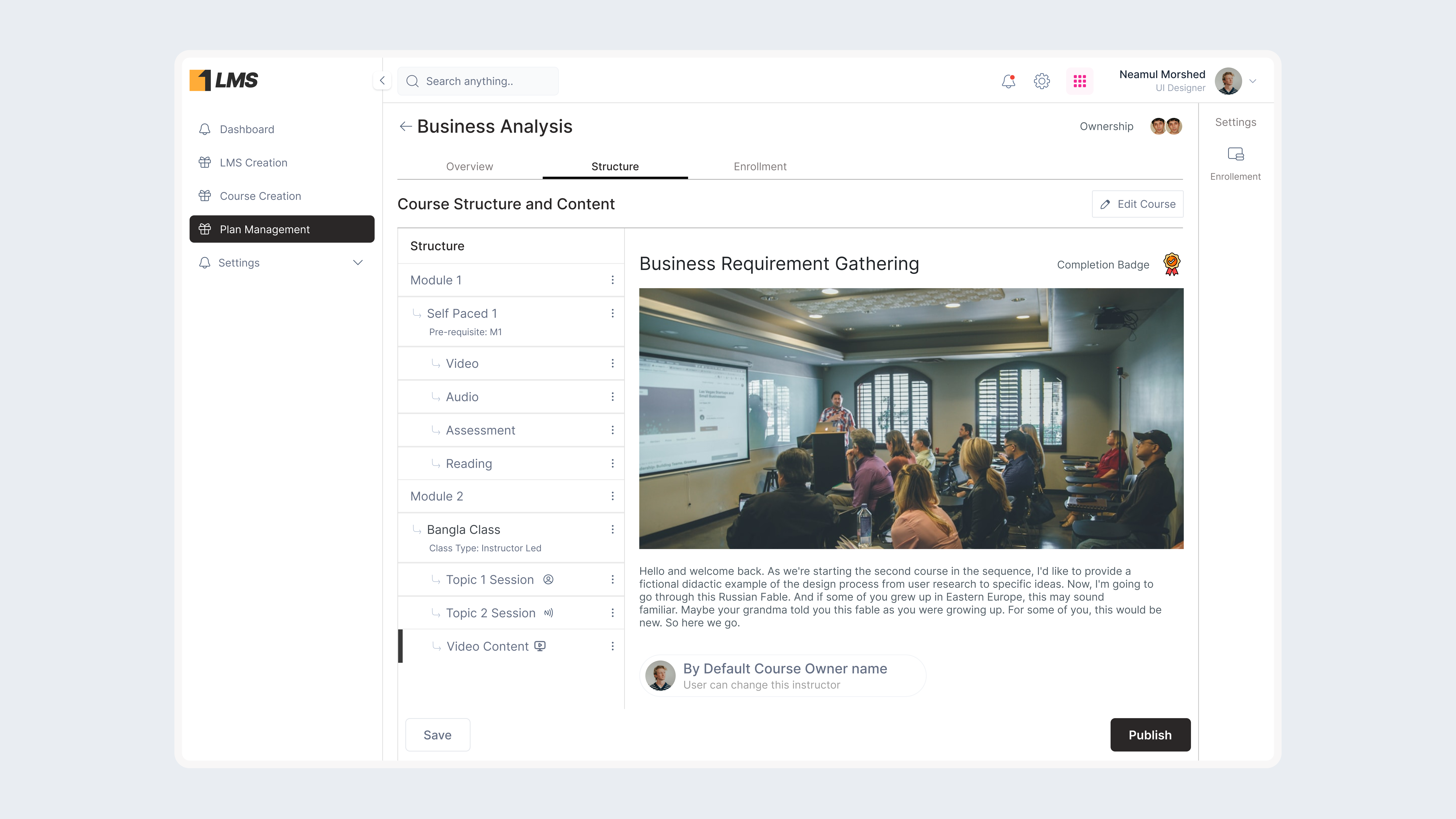
Introduce a modular structure, where instructors and admins can define the course's hierarchy (modules and classes). This allowed for both Instructor-Led and Self-Paced courses to be structured differently, addressing different learning formats.
.png)
Provide tools to add content types (videos, audio, assessments, readings) easily. Allow users to reuse assets via a content repository, making the process more efficient.
Introduced session creation features that could be scheduled and linked to classes. This feature allowed instructors to define class types, timings, and assign trainees to sessions.
.png)
A centralized Batch Hub to manage enrollment — admins can create and assign batches or assign individual trainees directly. Clear guidance was introduced for missing enrollments or session assignments.
Users could now review their course before publishing, with tabs for overview, structure, enrollment, and calendar. This step would display any validation messages for missing components, ensuring users don't miss important setup items before publishing.
We conducted moderated usability tests with five instructional designers using our high-fidelity Figma prototype. The feedback was overwhelmingly positive, but it also revealed a key area for improvement.
Users loved the canvas, but our initial design for adding new content to the outline was a small (+) icon that appeared on hover. Some users found this hard to discover.
We revised the design to include a more prominent, always-visible (+) button at the top of the structure panel. A secondary "Add" menu also appears when clicking the "more actions" (...) icon on any module, providing another clear entry point. This small change significantly improved the feature's discoverability and user confidence.
By eliminating unnecessary navigation and streamlining the workflow, we anticipate a major decrease in the time required to build a course.
Errors related to missing modules or incomplete content were significantly reduced, as validation messages and the guided flow ensured all steps were completed.
Based on our usability testing scores, we predict a massive jump in satisfaction compared to traditional LMS tools.
An intuitive tool encourages better organization and more complex course structures, directly benefiting the end learner.
The ability to reuse content through the repository led to higher efficiency, with instructors replicating successful courses for new cohorts.
This project reinforced a fundamental design truth: for
complex creative tasks, the tool must be a flexible workspace, not a rigid assembly
line.
By deeply understanding our users' frustrations and mapping their ideal
workflow, we were able to design a solution that feels less like a tool and more like a creative
partner.
This redesign of the Course Creation Module for ONE LMS enhances user experience and efficiency by introducing a structured, modular approach with clear feedback and validation. It reduces errors and lets users focus on content and engagement instead of setup. The system now includes additional modules for System Admin and Organizational Admin users, offering advanced customization, user permissions, and reporting, which improve platform scalability and management.